Going south on Interstate 75 just south of Cartersville, there is a bill board that has a beautiful lady standing off to the left side of the sign. There is some text at the top of the sign. As I zoomed past the billboard I could not read what the text says. Not because I was speeding. Not because I am nearsighted. I could not read the sign because the text is way too small for a billboard, much less one on the side of the expressway where everyone is moving at 70 mph.
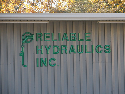
If the sign had a recognized brand such as the Coke wave or the Nike swoosh, the message would be obvious without even using words. However this billboard is a great example of how important sizing your letters is to get your message across.
There is another overhead sign at a fitness location near my home. My wife and I were sitting at the red light on the corner of this location. She looked at me and asked what the name of the fitness gym is. I could not say, once again because the sign is way too small for the distance and the area above the store front is much larger than the sign. Is your sign getting your message out or is it too small to be effective?
A visibility chart has been produced to be a guide to determine the letter size in order to determine the distance you want your sign to be visible. This visibility distance and letter size is based on information provided by Pennsylvania Transportation Institute, Penn State University and the United States Sign Council (USSC). C1998
Viewing Distance Minimum Required Letter Height
100 ft. 4”
250 ft. 10”
360 ft. (City block) 16”
500 ft. 22”
750 ft. 33”
1000 ft. 43”
1320 ft. (1/4 Mile) 57”
Large Dimensional Logo & Letters
Don’t waste your budget on letters that are not effective. Let Signs & More, Inc (770-383-8808) determine your letter size the next time you want to get the most out of your sign.


.png?width=117&height=117&name=2024%20Digital%20Decal%20(1).png)