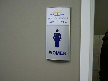
ADA - American Disabilities Act sign guidelines take effect March 2012.
All facilities that begin construction or renovation after March 2012 must accommodate new ADA sign guidelines. Key changes impact the sign height, typeface height/width and specific spaces between characters.
To read the DOJ's (Department of Justice) entire explanation of ADA sign regulations, go to www.Ada.gov/2010ADAstandards_index.htm and check out chapter 7: "Communication Elements and Features."
Traditionally, Braille is perceived as a person with visual impairment’s method of reading a sign. The Department of Justice states that only 5% of individuals with visual impairment use it to read. However, most are able to read tactile copy: the letters that have raised levels. The new regulations state that all tactile copy must be raised at least 1/32 inch above the sign or substrate surface. Also, these characters must be sans-serif, which means the text should not be italic or decorative.

There are many lengthy rules about everything from the stroke width, character spacing and height, line spacing, distance from the floor to the bottom of a sign's tactile characters being at least 4 feet but not exceeding 5 feet, Braille characters must be Grade II...YIKES! The rules go on and on. This is where most people want to just throw up their hands in frustration.

It is obvious that ADA compliance can be a daunting project. At Signs & More, we understand that. That is why you should give us a call now! We know the ins and outs of all the ADA sign guidelines and we can get you in compliance before the March 2012 deadline.


.png?width=117&height=117&name=2024%20Digital%20Decal%20(1).png)