What is the thought process that Signs & More will help you consider before you place your order for your new sign?
1. First you need to think of what you are trying to say with your sign. It should be clear and simple. The cleaner and clearer the message, the more impact it has.
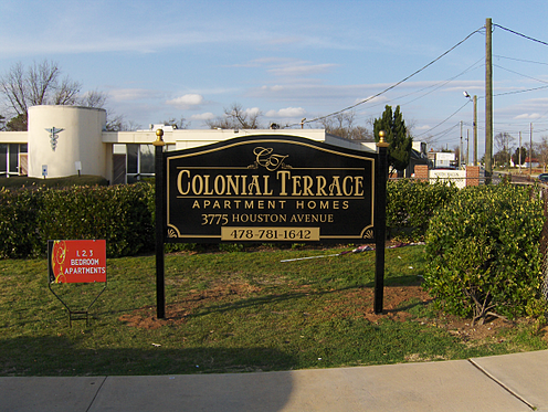
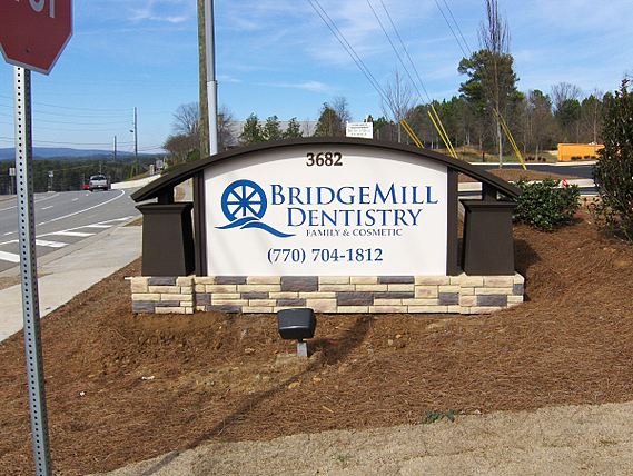
2. What image do you wish to portray? Professional, whimsical, elegant or FUN? The design of your sign is very important. Your sign conveys a lot about your business. A very simple design on less expensive materials may suggest no frills and discount prices. A bit more expensive type of sign material and design suggests a professional company that offers luxury goods or professional services.

3. Legibility is a vital aspect of a good sign design. Signs & More will design your sign to be easy to read. Our designers know what color combinations of the background and the foreground work the best together. The style of the font that is used also sends a message to your customers. If your font is too thin, frilly, or an odd typeface, it might make it hard to read.

Clean fonts will be seen. Use decorative fonts sparingly for logos or embellishments.

4. Lastly, limiting your sign to a maximum of two type styles is important. In most cases, the use of more than two type styles does nothing to improve the sign and often can look disorganized, or even worse, confuse the viewer.

Signs & More will help you with all of these points and create the most effective sign for your business. Give us a call today at 770-383-8808 and we will get started on your project!


.png?width=117&height=117&name=2024%20Digital%20Decal%20(1).png)