It is a common misconception that office signs for Marietta, GA, must always fall into the lobby signage category. While it is true that these are important, it is just as true that plenty of companies have found methods to use walls for expressing their brands in a host of other ways.
Wall Murals and Graphics
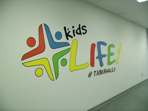
Take for example Tabernacle Baptist Church. They were looking for a way to use its wall as a means of expressing its kid-friendly nature while adding a splash of color to the otherwise white backdrop. With the wall graphics that use red, blue, green and yellow as well as black, this was a snap. The sizes of the graphics are such that they take up a good bit of space, which of course captures the eye of anyone walking down the hallway.
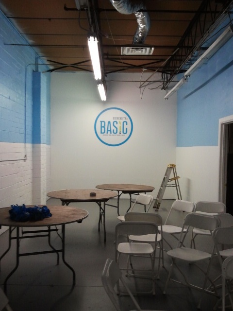
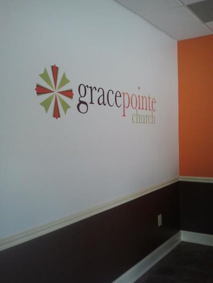
Training room walls, too, look great with a graphic on them. In the case of Draga Labs' Basic, the wall colors and the graphics design match perfectly. It makes the training area a welcoming space that adds a brand interaction for trainees. In addition, it ensures that folks know they came to the right place. Wall graphics also make an outstanding logo signage product. GracePointe Church chose to install wall graphics and lettering rather than a stand-alone lobby sign for its reception area. This product displays the name and logo of the faith community alongside its iconic color scheme.
Posters and Framed Wall Art
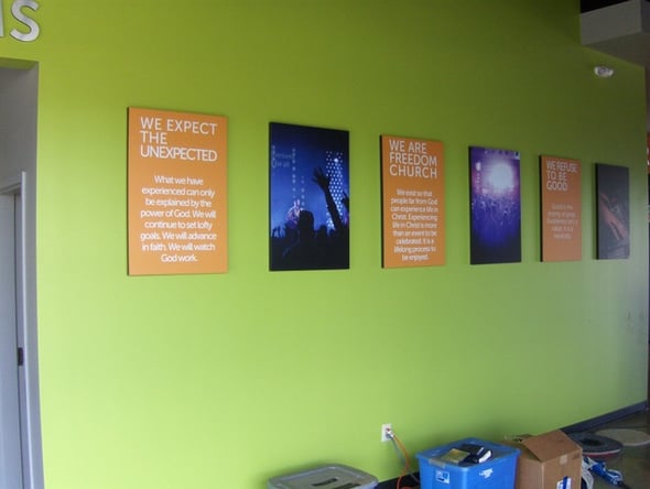
Posters enable visitors to a space to interact with the brand by learning more about the company, its mission, its history and other aspects that help to formulate an impression. Freedom Church uses multiple posters mounted on 1" thick foam to display photos of worship services as well as glimpses of the community’s mission and thoughts.
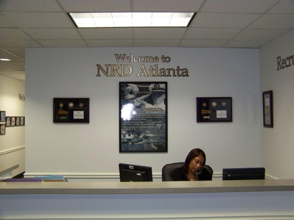
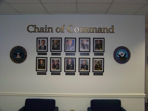
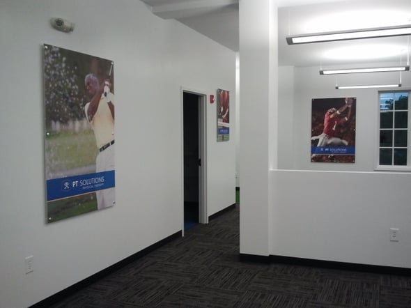
For the United States Navy Recruiting District Atlanta, the Gold and Black Lettering is part of the overall atmosphere this organization seeks to cultivate. Framed military honors and explanations give those at the recruiting center a glimpse into the bravery that everyday folks can achieve with the right training. A Navy chain of command display issues insights into the command structure of the organization. Mounted posters on standoffs also present visitors to PT Solutions with a glimpse of the activities they might be able to undertake in the future.
Classic Lobby Signs
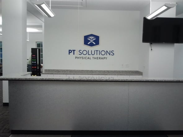
Of course, it would be foolhardy to think that the classic lobby sign is a thing of the past. Yet even here, there are options. PT Solutions branded its physical therapy office with dimensional letters of varying fonts and colors as well as a logo display. It features blue, gray, yellow and white, which look great against the white backdrop of the wall.
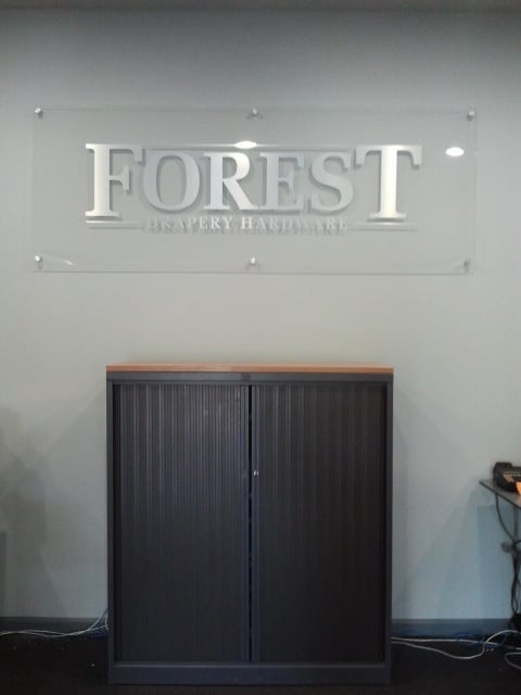
Forest Drapery Hardware chose an avant-garde clear acrylic board design with brushed silver lettering. Brushed aluminum standoffs add pizzazz to the setup. In some cases, a wall graphic replaces the traditional lobby sign. Sometimes, there is not even a company name display but only a logo. Because of its large size, this kind of display is easy to see.
When you need reception and wall signs for Marietta, GA, the professionals at Signs & More have the product solutions that are ideal for your venue. Call us today to set up a client consultation.



.png?width=117&height=117&name=2024%20Digital%20Decal%20(1).png)