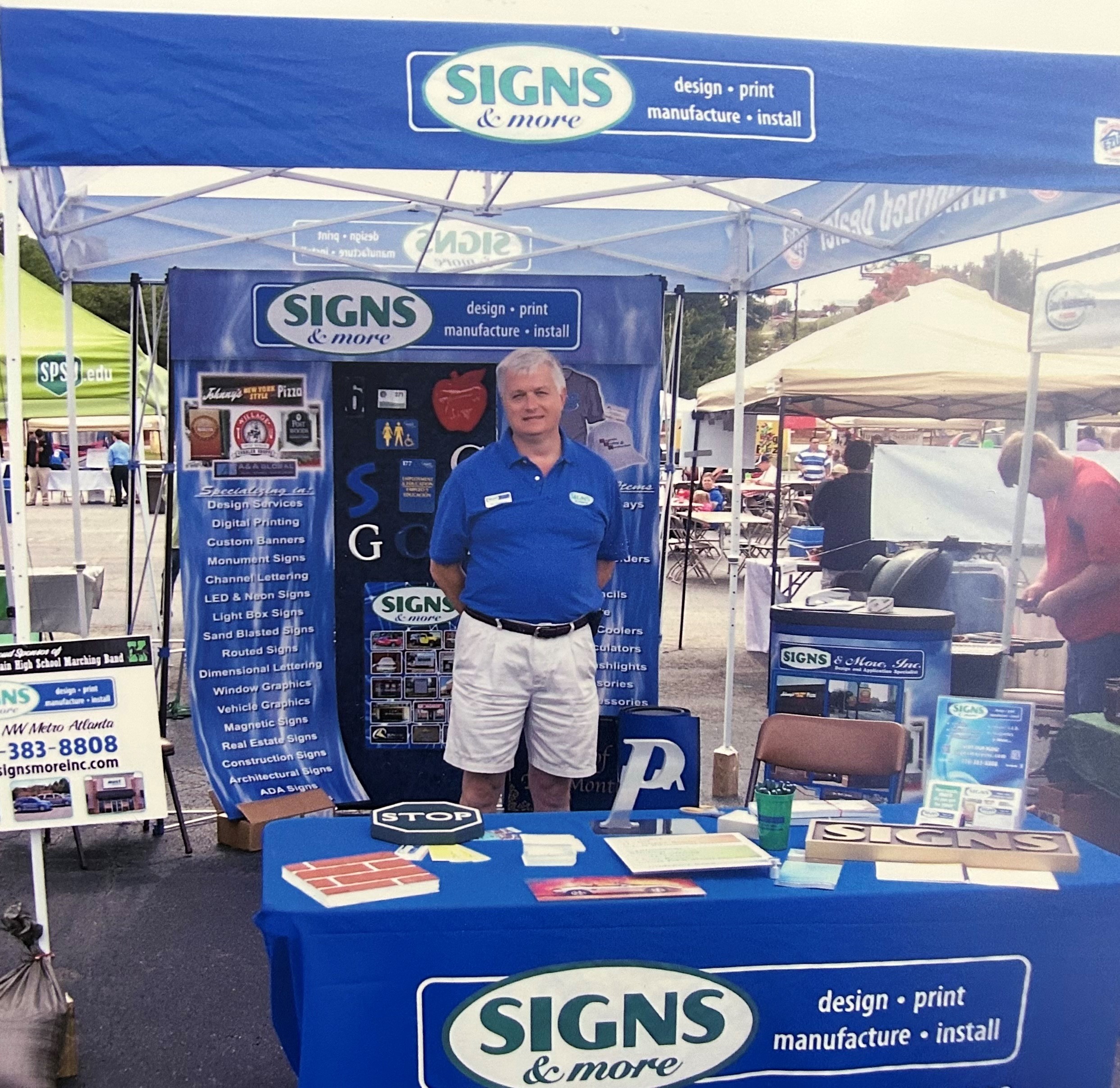
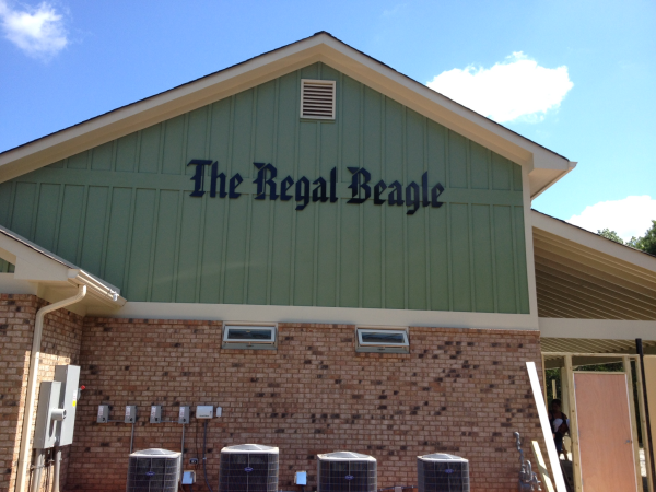
In early 2007, Bill and Jane Swanson embarked on a new adventure, seeking change and the opportunity to build something extraordinary. Bill, with a background in engineering and business, had spent his career in manufacturing and dreamed of owning a company that would create products that truly made a statement. After careful consideration, they decided to start a sign manufacturing company, believing it was the perfect avenue for their aspirations.
Read MoreDiscover the Journey of Signs & More: A Story of Growth and Resilience
Posted by Theodore Evans on Wed, Jul 26, 2023 @ 04:55 PM
Tags: Design, Cut Vinyl, Cobb County, Commercial Sign Business Cartersville GA, Best Sign Shop Cartersville GA, Church Signs Atlanta, Best place to get Eagle Scout Plaques, Building Signs Cartersville GA, Best Vehicle Graphics Georgia, Etch Vinyl, Custom ADA Braille Signs, Best Sign Company, entrepreneurship, small business
The Dos and Don'ts of Sign Placement: Maximizing Visibility and Impact
Posted by Theodore Evans on Thu, May 04, 2023 @ 09:00 AM
Signage is an essential aspect of any business, and its placement can significantly impact the effectiveness of the message it conveys. Signage can be used to promote products, services, or simply to provide directions to customers. It is important to ensure that your signs are placed in the right location to maximize visibility and impact. In this blog post, we will discuss the dos and don'ts of sign placement to help you create effective signage that can drive more traffic to your business.
The Dos of Sign Placement
-
Consider Visibility: When placing your sign, ensure that it is visible to your target audience. The sign should be placed in an area where people can easily see it, read it, and comprehend the message it conveys. You can achieve this by placing the sign at eye level or using a font that is large enough to be read from a distance.
-
Choose the Right Location: The location of your sign is crucial in determining its effectiveness. You should choose a location that is accessible to your target audience, such as a main street, a high traffic area, or a location where people frequently pass by. Make sure that the sign is not obstructed by trees, buildings, or other structures that may block the view.
Check out this sign with great visibility! -
Keep It Simple: Simplicity is key when it comes to sign placement. You should keep the message short and simple, using a clear and concise font. Avoid using too many colors, graphics, or images that may distract from the message.
-
Use Contrast: Contrast is an effective way to make your sign stand out. Use contrasting colors to create a visual impact that will capture the attention of your target audience.
-
Test the Placement: Before finalizing the placement of your sign, test it out. Walk around the area where you plan to place the sign to ensure that it is visible from different angles and distances. This will help you identify any potential issues with the placement and make adjustments accordingly.
The Don'ts of Sign Placement
-
Don't Place the Sign in a Busy Area: While it may seem logical to place your sign in a busy area, such as a crowded street, this can be counterproductive. A crowded area can make it difficult for your sign to stand out and capture the attention of your target audience.
-
Don't Use Complex Fonts: Complex fonts can be difficult to read, especially from a distance. Avoid using script or cursive fonts that may be hard to read. Instead, opt for simple, sans-serif fonts that are easy to read and comprehend.
-
Don't Overuse Graphics: Graphics can be a powerful tool in creating effective signage, but overusing them can be distracting. Avoid using too many graphics or images that may detract from the message you are trying to convey.
-
Don't Place the Sign in an Obstructed Area: Placing your sign in an obstructed area can significantly reduce its visibility. Make sure that the sign is not blocked by trees, buildings, or other structures that may obstruct the view.
-
Don't Forget to Consider Local Regulations: Before placing your sign, make sure that you are in compliance with local regulations. Some areas may have specific rules and regulations regarding sign placement, size, and content. Failure to comply with these regulations can result in fines or legal issues.
Sign placement is an important aspect of creating effective signage that can drive more traffic to your business. By considering the dos and don'ts of sign placement, you can create signage that is visible, impactful, and compliant with local regulations. Remember to keep it simple, choose the right location, and test the placement before finalizing it. With this info, you might be intrigued to get yourself a sign and that's where we come in! Contact us today!
Tags: Banners, Lobby Sign, Inside Signs, Cut Vinyl, 3-D Signs, Best Sign Shop Cartersville GA, Channel Letters Marietta GA, Channel Letters and Logo Box Signs, Business Signs Georgia, Best Sign Company
Wall Wraps - Amaze Your Visitors with Your Wall
Posted by Signs & More on Fri, Dec 23, 2022 @ 02:34 PM
The inside space for your business can be turned into another world using wall wraps! Any of your walls can be seen as a blank canvas that you can cover using any design or setting you want! This is a fantastic alternative to using paint to decorate your walls. The flexibility and creative freedom that comes with wall wrap is enough reason to try it out!
Read MoreTags: Cut Vinyl, Wall Graphics Marietta GA, Wall Wraps and Wall Graphics Atlanta, Wall Murals for Atlanta Businesses, durable, logos, logo sign, signs, wall wraps
Signs Atlanta | Sundial Plumbing Signs Marietta
Posted by Signs & More on Wed, Mar 23, 2011 @ 08:15 AM
When Mitzi Smith, owner of Sundial Plumbing, renovated her location on Old 41 in Marietta, there were several things that Signs & More did to get this new building up to par with Sundial standards. Corporate colors are important to Mitzi and Signs & More specializes in matching PMS colors.
Tags: Lobby Sign, Marietta, Inside Signs, Cut Vinyl


.png?width=117&height=117&name=2024%20Digital%20Decal%20(1).png)