SIGNS & MORE, INC. BLOG - Sign, Banner & Vehicle Graphics Facts & Information

The Dos and Don'ts of Sign Placement: Maximizing Visibility and Impact

Posted by Theodore Evans on Thu, May 04, 2023 @ 09:00 AM

Signage is an essential aspect of any business, and its placement can significantly impact the effectiveness of the message it conveys. Signage can be used to promote products, services, or simply to provide directions to customers. It is important to ensure that your signs are placed in the right location to maximize visibility and impact. In this blog post, we will discuss the dos and don'ts of sign placement to help you create effective signage that can drive more traffic to your business.

The Dos of Sign Placement

  1. Consider Visibility: When placing your sign, ensure that it is visible to your target audience. The sign should be placed in an area where people can easily see it, read it, and comprehend the message it conveys. You can achieve this by placing the sign at eye level or using a font that is large enough to be read from a distance.

  2. Choose the Right Location: The location of your sign is crucial in determining its effectiveness. You should choose a location that is accessible to your target audience, such as a main street, a high traffic area, or a location where people frequently pass by. Make sure that the sign is not obstructed by trees, buildings, or other structures that may block the view.


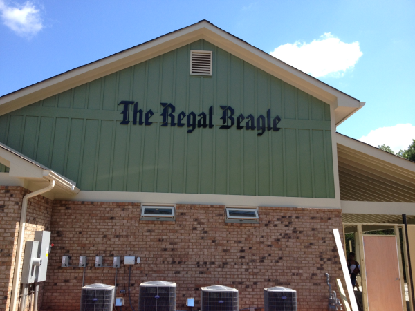
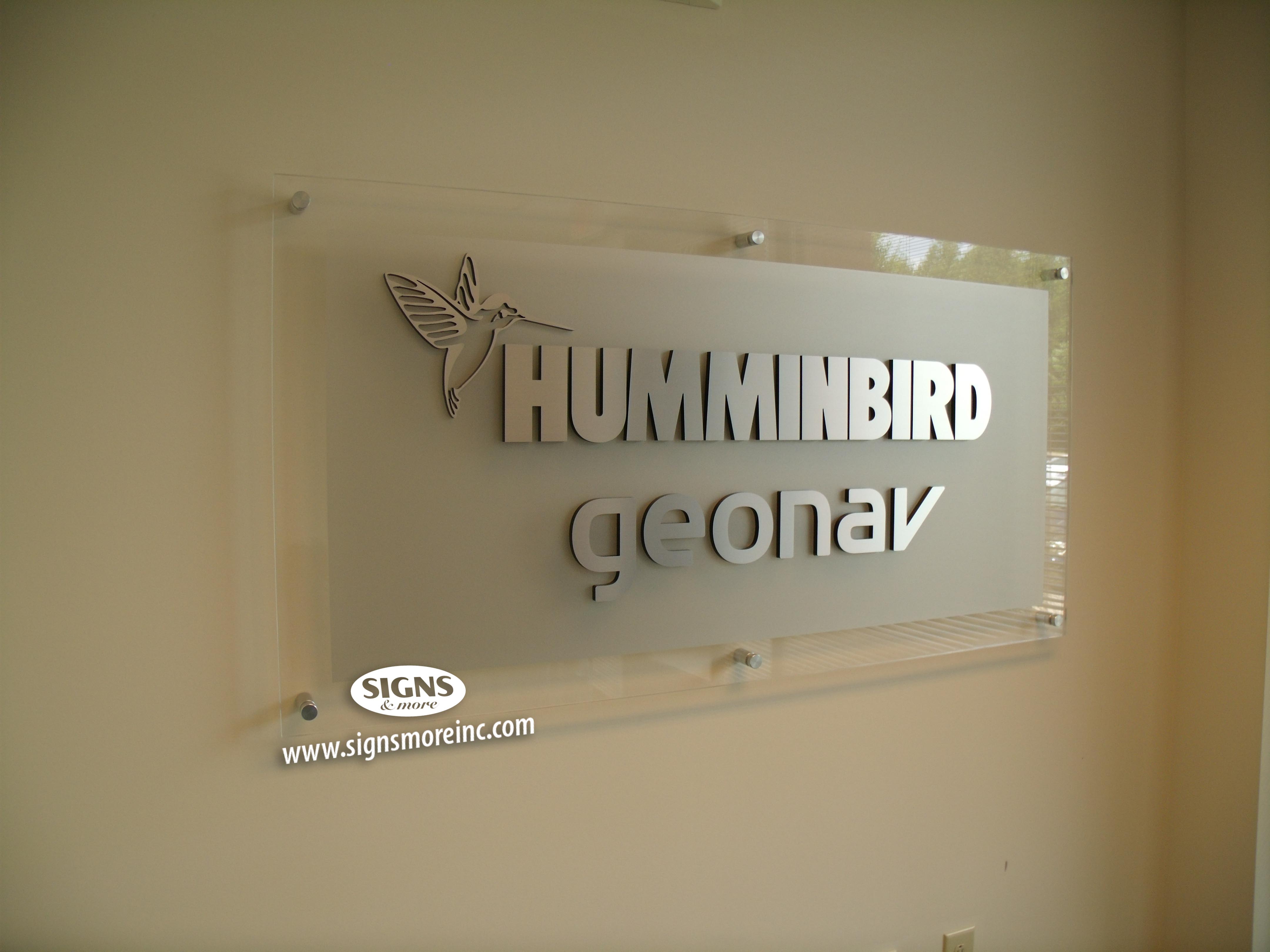
    Check out this sign with great visibility!
  3. Keep It Simple: Simplicity is key when it comes to sign placement. You should keep the message short and simple, using a clear and concise font. Avoid using too many colors, graphics, or images that may distract from the message.

  4. Use Contrast: Contrast is an effective way to make your sign stand out. Use contrasting colors to create a visual impact that will capture the attention of your target audience.

  5. Test the Placement: Before finalizing the placement of your sign, test it out. Walk around the area where you plan to place the sign to ensure that it is visible from different angles and distances. This will help you identify any potential issues with the placement and make adjustments accordingly.

The Don'ts of Sign Placement

  1. Don't Place the Sign in a Busy Area: While it may seem logical to place your sign in a busy area, such as a crowded street, this can be counterproductive. A crowded area can make it difficult for your sign to stand out and capture the attention of your target audience.

  2. Don't Use Complex Fonts: Complex fonts can be difficult to read, especially from a distance. Avoid using script or cursive fonts that may be hard to read. Instead, opt for simple, sans-serif fonts that are easy to read and comprehend.

  3. Don't Overuse Graphics: Graphics can be a powerful tool in creating effective signage, but overusing them can be distracting. Avoid using too many graphics or images that may detract from the message you are trying to convey.

  4. Don't Place the Sign in an Obstructed Area: Placing your sign in an obstructed area can significantly reduce its visibility. Make sure that the sign is not blocked by trees, buildings, or other structures that may obstruct the view.

  5. Don't Forget to Consider Local Regulations: Before placing your sign, make sure that you are in compliance with local regulations. Some areas may have specific rules and regulations regarding sign placement, size, and content. Failure to comply with these regulations can result in fines or legal issues.

Sign placement is an important aspect of creating effective signage that can drive more traffic to your business. By considering the dos and don'ts of sign placement, you can create signage that is visible, impactful, and compliant with local regulations. Remember to keep it simple, choose the right location, and test the placement before finalizing it. With this info, you might be intrigued to get yourself a sign and that's where we come in! Contact us today! 


Read More

Tags: Banners, Lobby Sign, Inside Signs, Cut Vinyl, 3-D Signs, Best Sign Shop Cartersville GA, Channel Letters Marietta GA, Channel Letters and Logo Box Signs, Business Signs Georgia, Best Sign Company

Window Vinyl - Making Your Storefront More Friendly

Posted by Signs & More on Thu, Dec 22, 2022 @ 04:06 PM

Window decals are adhesive window stickers used for a number of reasons for businesses. One side is adhesive and the other displays anything you want. What’s nice about the sticky decals is that it is not permanent and if needed can be redone. The stickers can display a multitude of information including logos, business hours, product info, seasonal images, deals, and so much more. 

Read More

Tags: Signs & More, Window Graphics, Inside Signs, Retail Store Signs, durable, stand out, aesthetic, etched glass privacy door, frosted window, logo sign, signs, advertising, window sign printing

Signs Atlanta | America's Mart Signage

Posted by Signs & More on Mon, Apr 16, 2012 @ 08:10 AM

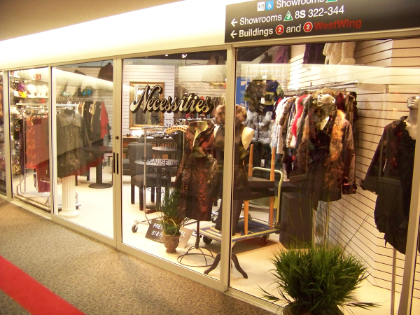
If you are fortunate enough to have a space at The America's Mart in downtown Atlanta, then you know your space is all about location and bringing buyers to your location with signage and print ads.  With the myriad of locations, showrooms & choices a buyer has to stock their shelves with the many choices of products, you need to be found easily and quickly.  With effective window signage, you will also remain memorable in your buyer's mind.

Read More

Tags: Window Graphics, Logo, Inside Signs

Apartment Signs Atlanta | Interior/Exterior Apartment Signs

Posted by Signs & More on Fri, Sep 02, 2011 @ 07:25 AM

You have a new apartment community or one that needs some updating in your buildings.  Wow – depending on the size of your complex, that could be a LOT of work!  It all seems so overwhelming, doesn’t it?  However, it doesn’t have to be!  Let Signs & More help you with all of your interior/exterior apartment signs.  We will do the on-site surveys and provide proofs of all signage before production/installation.  Experience shows this as a relatively painless solution to your needs. 

Read More

Tags: Apartment Signs, Inside Signs

Signs Atlanta | Help People Find Your Business

Posted by Signs & More on Fri, Jul 22, 2011 @ 07:04 AM

I was recently in an establishment on a personal business appointment.  The building was big and had many offices in it.  I was a tad frustrated with the lack of signage to let me know where to go and how to get to my destination.  Now – being a “sign person," of course I was looking for good directional or wayfinding signage.  However, just regular “non-sign people" would be frustrated also I’m sure.

Read More

Tags: Lobby Sign, Wayfinding Signs, Inside Signs

Signs Atlanta | Why YOU need Lobby Signage at your Business

Posted by Signs & More on Mon, Jul 18, 2011 @ 06:30 AM

Do you need Lobby Signage? YES!! Lobby Signs are the first thing people see when entering your office, store, building, restaurant, hotel, center, etc. Lobby signs are seen by the sharpest marketing experts not as an expense but as an investment that plays a fundamental role in branding, message, visual identity and more. Lobby Signs come in a large variety of materials, design, mounting preferences, size, font, colors, and more. They can be lighted internally or externally or left alone. Often a set of ceiling cans will light a lobby sign effectively, providing shadowing to emphasize the 3-D effect.

Read More

Tags: Lobby Sign, Inside Signs, 3-D Signs

Signs Atlanta | Sundial Plumbing Signs Marietta

Posted by Signs & More on Wed, Mar 23, 2011 @ 08:15 AM

When Mitzi Smith, owner of Sundial Plumbing, renovated her location on Old 41 in Marietta, there were several things that Signs & More did to get this new building up to par with Sundial standards.  Corporate colors are important to Mitzi and Signs & More specializes in matching PMS colors. 

Read More

Tags: Lobby Sign, Marietta, Inside Signs, Cut Vinyl

Signs Atlanta | Storefront Business Signage 101 ~ Part 3 of 3 INSIDE

Posted by Signs & More on Mon, Mar 14, 2011 @ 08:11 AM

OK.  You have the front of your business looking fantastic.  You have people coming to your store, walking in and shopping.  Now – you need to concentrate on the INSIDE of your establishment.  To end our Storefront Signage 101 Series – we will concentrate on the interior part of your business. 

Read More

Tags: Inside Signs, Retail Store Signs