Reception signs for Marietta, GA, businesses must market and brand a company. More than just functional signage products that tell visitors they have come to the right place, they actually set the tone for the interaction between the company’s staff and the client or customer. Standing out is part of being successful. How can you achieve this goal?
Create a Play of Light and Shadows
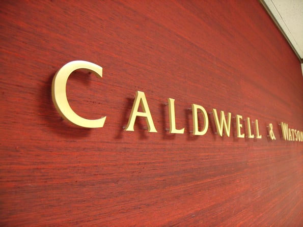
When you have an impressive wall color and a lighter-colored sign, having shadows displayed actually sets you apart from the competition. Case in point is Caldwell, which asked our graphic artists to create dimensional letters in a gold color that we then installed against a red backdrop. Using offsets, we were able to create shadows of the letters, which greatly enhances the look of the focal wall and makes this lobby sign quite memorable.
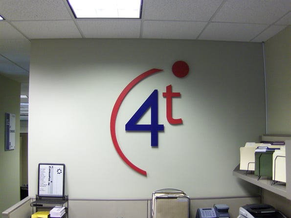
Going 3D
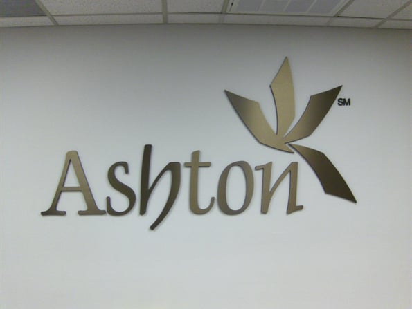
The three-dimensional display also works well. You just need to increase the thickness of your letters. Standing out from the wall, quite literally, your reception signage now becomes a focal point for those visiting. There is something impressive about a sign that is not just tall and wide, thereby taking up a good portion of the focal wall, but also thick and standing out from the surface to which it is mounted.
Visually Interesting Signage Designs
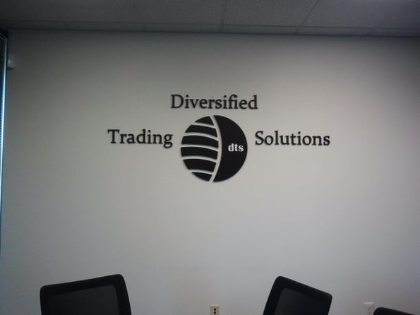
An interesting logo and name design is always a big plus when you need a sign that stands out. Diversified Trading Solutions shows how it is done. The center logo supports the name of the company. At the same time, it creates a visually stimulating display that is as attractive as a piece of wall art but still brands and markets the company as well as any mere functional product would do. Combining artistic designs with a strong informational message appeals to clients.
Acrylic Works Well in a Multitude of Settings
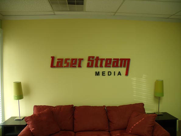
Whether you are looking for dimensional letters or a panel setup, acrylic is an excellent material to consider when commissioning your sign. Adding dimensional letters to an acrylic panel and then mounting it with offsets gives you the 3D appearance that works so well. Conversely, you also have the option of using PVC or metal. Aluminum in particular is great to work with in an office setting and presents with polished or brushed finishes.
Commissioning Your Reception Area Signs in Marietta, GA
The experts at Signs & More understand that the lobby sign is one of the most important products you commission for your office. We work with your management team to create a look that appeals to your clients and earns you the respect of those in your niche. During your client consultation, we discuss the use of materials, colors and artwork that you already have on file.
If you are just starting out, our graphic artists can help you with the design of a logo and company name look that is appealing and bespeaks your approach to doing business. For those who are re-branding or are in the early stages of considering this move, we provide assistance as well. We show you on sketches how small changes to your sign’s font, colors or setup can make a huge difference in its overall marketing and branding abilities.



.png?width=117&height=117&name=2024%20Digital%20Decal%20(1).png)